Yeoman's Weblog (Archive)
This blog was migrated from http://yeomanseiko.spaces.live.com
Marinemaster SBDX001 photo

Click on the image to see full size photo
Collecting watches is my hobby but watch photography is not. I take photos of my watches only to make it easier for me to admire them. It is easier to admire a watch on the computer screen because it is bigger than the actual watch and therefore easier to see the fine details. I don’t want to use the loupe to look at my watches all the time.
If you have taken photos of your watches, you will know that it is not easy. Every watch has its areas of difficulty. For example, the ALBA Stingray has a textured dial that is not easy to capture. The SBGR029 also has a texture dial and on top of that, a shiny bezel that will reflect anything that comes near to it.
As for the Marinemaster, the difficult part is the bezel. The glossy surface tends to turn greenish and brownish if you try to photo it in a light tent or use white cardboard as reflector. Below is a photo that I took some years ago. If you look at the MM in the photo, you will notice that the bezel has greenish and brownish color instead of black. This is something that I want to avoid when I take photos of the MM.
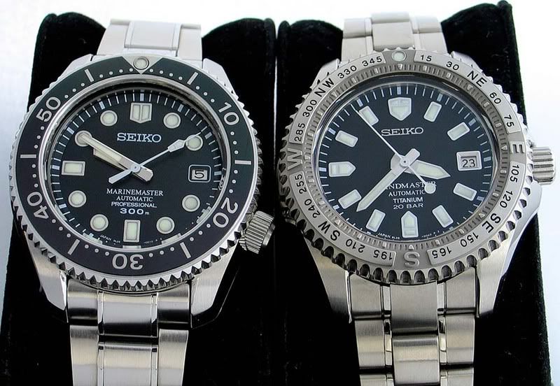
Click on the image to see full size photo
Now I will elaborate on my new MM photo.
First, I must say that it is not a perfect photo. There is still room for improvement.
I have taken lots of watch photos and most of the time, I use a piece of white paper as the backdrop. In this photo, time I tried something new. I wanted the photo to look bluish so I used the back of this GS catalog as the backdrop.

Since the MM is a dive watch, I also wanted it to look slightly bluish instead of just having a blue backdrop. So, I employed some secret techniques to create some blue reflections on the watch. You can see them on the markers, hands and some parts of the watch case.
The MM is known for its finishing and therefore it is important for the photo to capture the shape of the lugs. This involves adjusting the position and angle of the light source and reflectors so as to create contrasting shades on the different facets of the lugs to bring out the definition lines between them.
I applied diffusion such that the light hit different parts of the watch with different intensity as opposed to letting the light hit the watch evenly. As you can see, the areas around 3 and 9 o’clock get ‘harder’ light while the lugs get ‘softer’ light. I think the combination of hard and soft light makes the photo look more realistic.
Lastly, I did some touch ups such as cropping and sharpening with Photoshop.
What I have described above is just how I planned and took this photo. It is by no means the standard way of taking a watch photo.

Click on the image to see full size photo

Cell phone shot:

Hi Thomas,I’m surprised that you say you aren’t that interested in photography, because I think your photos are really good! It’s clear you work hard on many of your pictures to come up with something good.Actually, I often don’t like photos that are “too good.” Ones that look like they’ve been air brushed look phony to me. I don’t mind if there are some reflections on watch shots, because often that is how a watch appears when we look at one in our daily lives. People often apologize for cell phone pictures, but some of my favorite snaps are candid shots from cell phones.My strong point is definitely not my photos – I’m a word guy. But I enjoy taking pictures. I especially like it when they come out surprisingly good, or anyway, are unexpectedly interesting. http://i15.photobucket.com/albums/a388/banderjp/IMG_3293.jpgRegards,Bryan
Hi Bryan,
I don\’t enjoy taking watches pics because there\’s too much work involved. I guess it is for the same reason that people delay posting watch articles. I am one of them.
However, I have a reputation to maintain and that\’s why I need to ensure that my pictures are reasonably good. 🙂
Regards,
Thomas